The number is the commodity. The comparison is the product.
Every competitor here can hand someone a score. Nobody remembers a score. What a stranger gives an address for is knowing who else is in the room.
Answers given freely beat answers taken.
Every question offers a way to stop. That costs conversion, and buys a signal worth having — plus a KPI that can't be inflated.
I didn’t build a funnel. I built a generator.
Four builds, one config object. A new variant is two lines.
Why the flow is designed this way


The score is free. Resolution is sold.
Withholding the score is the obvious move. I rejected it. A withheld score turns the gate into a toll, and a tolled user either leaves or types a junk address — corrupting the exact metric we’re optimising.
So the score arrives immediately, stated as final: “That number is yours. It doesn’t change from here.”
Under it sits one comparison — everyone, every adult alive — deliberately worthless. The user holds something real and can see it tells them nothing about themselves.
Each answer pays out on the screen it’s asked on
Continent, country, city. Every answer draws a narrower distribution and stacks it under the last. Three profile questions read as a reward instead of a form.
The percentile falls as often as it rises
Berlin sits above the German mean, so a Berliner ranks lower among neighbours than among countrymen. A funnel where every answer flatters you is a compliment machine, and users work that out in two screens.
Every screen offers a way out
“Show me what you have — you can stop at any level.”
- An answer volunteered under an explicit offer to stop is a better signal than one collected by momentum.
- Which layer people stop at is the most interesting number in the flow — a direct read on how much geography someone trades for resolution.
- Nobody else on this keyword is collecting it.
Same logic at the gate: one field, no password, opened by a sign-in link. A password at the moment of maximum anticipation is the most expensive field in the funnel and buys nothing this product needs.
Desktop is a different composition, not a wider one
A 520px column centred in a desktop viewport is a phone screenshot with wallpaper around it — which is what most “responsive” funnels ship.
- A rail carries state that never fits on a phone: where you are, how long is left, and after the test your score at 104px, held in view.
- The stage carries only what this screen asks for. Answers in a 2×2 grid, halving the eye path.


Reading measure is unchanged, so the device isn’t a confounder in the A/B tests.
Data quality is a design constraint, not a report
- CVR alone is inflatable. A hard gate buys accounts worth nothing, so it’s paired with deliverable-email rate.
- Two knowledge items only, at slots 1 and 12. Asking what year a product launched measures recall — and recall varies by age, country and schooling, the exact axis the bands claim to normalise away.
- Every visitor gets a different test, sampled from a 41-item bank against a fixed blueprint. Answer-sharing stops working; per-item pass rates stay measurable.
Or just click through it here
All four builds run inside this page — no backend, no build step. Switch the build, switch the device.
Open the browser console while you click — every build logs the funnel events it would send.
How it was built, and with what
The division of labour
One wrong answer in a test claiming to measure intelligence destroys every other item. So the bank is split by factual risk:
| Layer | Produced how | Risk |
|---|---|---|
| Visual matrices | Generated from a transformation rule | None — no fact to get wrong |
| Reasoning traps | Canonical puzzles, settled answers | Low |
| Knowledge items | Authored, then verified individually | Managed — and only here |
What the automated checks caught
Checks run over the whole bank on every build, so adding 200 questions costs writing, not reviewing. They found:
- A correct answer that explained its own trick.
- Three items where the right answer was visibly the longest — markable without reading the question.
- A percentile that read as praise for a below-average score.
- An infinite redirect loop in one variant; profile questions silently skipped in another. Both invalidated the experiment, not the layout.
- The privacy line vanishing from all four files after a config refactor, failing silently.
Where I didn’t let it decide
The central trade — give the score away, sell the comparison — is a judgement about what a stranger hands an address over for, and the whole funnel rests on it.
Same for the two calls that cost conversion on purpose: letting the percentile fall, and putting a way out on every screen. A model optimising for CVR removes both.
The model, and three bets
Where the money leaks
No traffic exists yet, so I sized this from published quiz benchmarks — ~65% of starters complete, a well-framed gate captures 70–80% of completers. Per 100 visits:
| Stage | Remaining | Lost |
|---|---|---|
| Lands, answers Q1 | 70 | 30 |
| Completes the test | 45 | 25 |
| Answers the narrowing questions | 38 | 7 |
| Creates the account | 29 | 9 |
CVR ≈ 29%. Sanity check: 29 of 70 starters is 41% start-to-lead against a ~40% benchmark.
The funnel multiplies, so ten points anywhere is worth the same. What differs is headroom. The gate at 75% is near the 80% ceiling; completion at 65% is merely average and a short test can reach 80%.
Three A/B tests, ranked by headroom
Six questions instead of twelve
fewer chances to quit, and a cheaper promise on entry — “90 seconds” instead of “3 minutes”.
a six-item result is easier to dismiss as a toy.
completion rate and CVR-among-completers, separately. They should move in opposite directions — that split is the finding.
the six items are a representative sample of the same blueprint. Taking the first six slots would have stripped every visual item and tested length and item type at once.
Show the payoff before question one
the control assumes the visitor already knows what they’re getting. This opens on a sample band stack instead.
reintroduces the interstitial the control removed; a filled-in sample may read as fabricated.
start rate. Everything downstream should be unchanged — if it isn’t, the variant is selecting a different visitor, not converting more of the same one.
Move the gate to the end
give everything away and let the account sell continuity. A user holding a finished result may reciprocate where one stopped mid-curiosity resents the ask.
by the end, the curiosity that carried them here is spent.
CVR would mislead here, so guardrails decide it. If CVR rises while deliverability falls, the variant is buying inventory, not users — and I wouldn’t ship it on a CVR win alone.
How they’re built: one source, one CONFIG object, screen order derived from config. A diff against control is two to four lines.
Test 1   testLength: 6
Test 2   reveal.entry: 'payoff-first'
Test 3   gate.position: 'after-bands'
What I killed
- A cognitive-decline angle. It converts, and Lumosity paid the FTC $2M for it. It also contradicts the keyword’s intent.
- A literal world map. The obvious way to draw this, and decoration — the distributions carry the meaning.
- Results delivered by email. Deferring gratification on mobile is an abandonment event.
- A per-question timer. Adds credibility, adds abandonment. Better tested than assumed.
Three creatives
Same score, different room. The ads don’t advertise a test. They advertise the mechanism, by showing the actual bands the user will earn.

At 50px there’s room for one idea, so everything else is cut. Two shrinking distributions do in 60 pixels what copy would need a sentence for. A banner that explains loses to one that shows.
Download iqly-ad-320x50.png

Two bands, the same column moving between them. The viewer sees the mechanism before clicking rather than a promise about it. CTA is “Find your place”, not “Take the test” — the test is the price, not the offer.
Download iqly-ad-250x250.png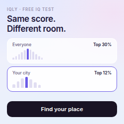

Three real bands, score constant, percentile moving, movement named. It runs downwards on purpose. An ad whose sample result flatters you is selling a compliment; one showing a score drop is selling a measurement. It is also the exact image Test 2 puts on the entry screen, so the two can be read against each other.
Download iqly-ad-1080x1920.png
Message match is a conversion argument and an auction one — Google scores landing-page experience, so a creative that oversells its destination raises CPC on the other side. The ad shows distributions. The landing screen shows distributions.
- Two keywords, two funnels. “Free iq test” arrives pre-sold; “iq test” includes people wanting a serious paid assessment. If one converts at 35% and the other at 20% at twice the CPC, that’s a bidding decision, not a funnel one.
- The shareable result moves no CVR. An organic visitor enters both numerator and denominator. It moves cost per account.